반응형
버블차트는 세 가지 값이 필요함
특정 좌표에 대한 분포로 만들어주는거라
기본적으로 x, y 축과 그에 대한 데이터가 필요
더보기
<!DOCTYPE html>
<html>
<head>
	<meta charset="UTF-8">
	<meta name="viewport" content="width=device-width, initial-scale=1"/>
<title>jQuery</title>

	<!-- 제이쿼리 모바일, 제이쿼리 라이브러리 파일 -->
	<link rel="stylesheet" href="http://code.jquery.com/mobile/1.4.5/jquery.mobile-1.4.5.min.css"/>
	<script src="http://code.jquery.com/jquery-1.11.1.min.js"></script>
	<script src="http://code.jquery.com/mobile/1.4.5/jquery.mobile-1.4.5.min.js"></script>

	<!-- jqPlot 기본 라이브러리 파일 -->
	<link rel="stylesheet" href="jqplot/jquery.jqplot.min.css"/>
	<script src="jqplot/jquery.jqplot.min.js"></script>

	<!-- jqPlot 파이 차트 플러그인 파일 -->
	<script src="jqplot/plugins/jqplot.bubbleRenderer.min.js"></script>

	<script>
		$(document).ready(function() {
			var arr = [
						[11, 123, 1236, "수원"],
						[45, 92, 1067, "인천"],
						[24, 104, 1176, "서울"],
						[50, 23, 610, "충청"],
						[18, 17, 539, "오산"],
						[7, 89, 864, "부천"],
						[2, 13, 1026, "동탄"]
					  ];
			plot1 = $.jqplot('chartdiv', [arr], {
				title: '버블 그래프 예제',
				seriesDefaults: {
					renderer: $.jqplot.BubbleRenderer,
					rendererOptions: {
						bubbleAlpha: 0.6
					},
					shadow: true,
					shadowAlpha: 0.05
				}
			});
		});
	</script>
</head>
<body>
	<div data-role="page">				<!-- 1. 페이지 선언  -->
		<div data-role="header">		<!-- 2. 페이지의 상단 부분 선언  -->
			<h1>header 영역</h1>
		</div>
		<div data-role="content">		<!-- 3. 페이지의 컨텐츠 부분 선언  -->
			<div id="chartdiv" style="height: 400px; width: 300px;">
				<!-- 차트 표시 영역 -->
			</div>
		</div>
		<div data-role="footer" data-position="fixed">	<!-- 4. 페이지의 하단부 선언 -->
			<h4>footer 영역</h4>
		</div>
	</div>
</body>
</html>
22 :: var arr 에서,
첫번째 값 : x축 값,
두번째 값 : y축 값,
세 번째 값 : 크기,
네 번째 값 : 텍스트?
39 :: shadowAlpha : 투명도조절
투명도는 alpha 값이라고 하며 0 부터 1 사이의 실수 값으로 나타낸다.
1 이상으로 놓아도 그 값이 1로 적용된다.
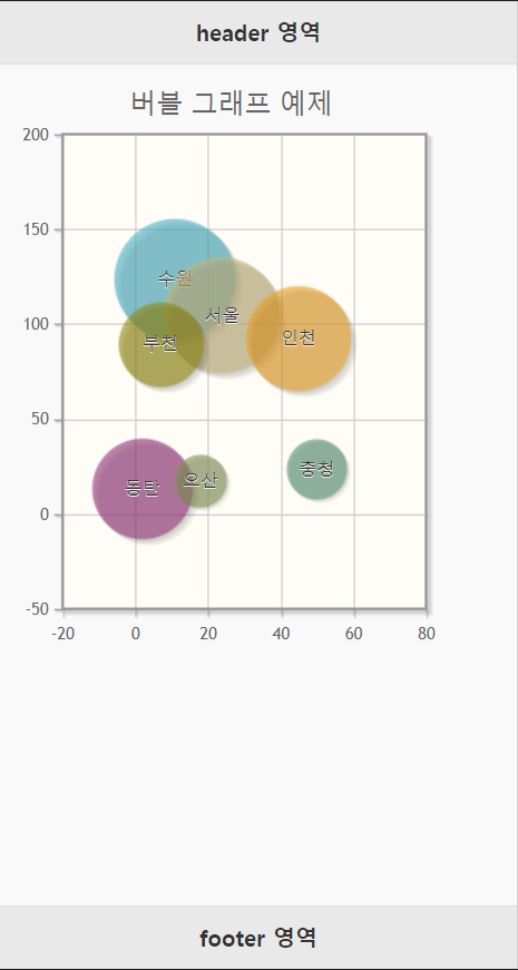
* 아래의 실행 결과를 보면
=> 데이터 크기랑 x축, y축에 대한 값을 비교 해 봤을 때, 데이터가 해당 범위보다 상당히 작게 나온다.
실제 값보다 작게 보이는 이유는 기본적으로 전체 데이터 중 가장 큰 것을 100 으로 보았을 때 나머지들의 값을 그에 대한 비율로 원에 대한 반지름 값을 설정한거라 그렇다.
실행 결과
반응형
'Java . Spring . Web . SQL' 카테고리의 다른 글
| SQL : DDL (Data Definition Language) : 데이터 정의 언어 (0) | 2020.09.13 |
|---|---|
| 2020/09/10 : jQuery : xml bookApp (0) | 2020.09.11 |
| 2020/09/10 : jqPlot : 파이(pie) 차트 (원형 그래프) (0) | 2020.09.10 |
| 2020/09/10 : jqPlot : 바(bar) 차트 (막대 그래프) (0) | 2020.09.10 |
| 2020/09/10 : jqPlot : 라인 차트 (꺾은선 그래프) (0) | 2020.09.10 |


댓글